
Design systems have become essential for teams looking to create consistent, scalable, and efficient product designs. But building an effective design system requires more than just collecting UI components—it demands strategic thinking, collaboration, and ongoing maintenance. This guide walks you through the entire process, from initial concept to successful implementation.
What Is a Design System?
Before diving into the creation process, let's clarify what a design system actually is. A design system is a collection of reusable components, guided by clear standards, that can be assembled to build any number of applications. It's more than just a UI kit or style guide—it's a complete product that serves products.
A comprehensive design system typically includes:
- Design principles - The underlying philosophy and values that guide design decisions
- Component library - Reusable UI elements with defined behaviors and properties
- Design tokens - Variables that store visual design attributes (colors, typography, spacing, etc.)
- Documentation - Guidelines explaining how and when to use components
- Code implementation - The technical counterpart to the visual components
- Governance model - Processes for maintaining and evolving the system
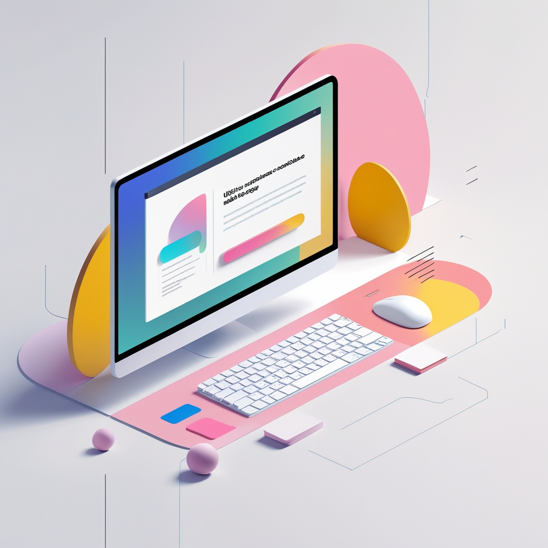
 The structure of a comprehensive design system showing the relationship between various components.
Phase 1: Planning Your Design System
The success of a design system largely depends on thorough planning. This initial phase lays the foundation for everything that follows.
Audit Your Current Design Landscape
Before creating anything new, take stock of what already exists:
- Collect all design assets from existing products
- Identify inconsistencies and redundancies in UI elements
- Document current design patterns and their variations
- Analyze which components are used most frequently
This audit will reveal the scope of your design system and highlight areas that need the most attention.
Define Goals and Scope
Clarify what you want to achieve with your design system:
- What specific problems should it solve?
- Which products and platforms will it support?
- What level of detail and comprehensiveness is needed?
- What metrics will you use to measure success?
Be realistic about scope, especially for the first version. It's better to start with a smaller, well-executed system than an ambitious one that's never completed.
Secure Stakeholder Buy-In
Design systems require significant resources and cross-functional support. To secure buy-in:
- Quantify the business benefits (time savings, consistency improvements, reduced technical debt)
- Provide examples of inefficiencies the system will address
- Highlight how it will improve the user experience across products
- Create a high-level roadmap showing major milestones
Assemble Your Team
Identify who will be involved in creating and maintaining the system:
- Dedicated design system team members (if resources allow)
- Representatives from product design teams
- Developers who will implement the components
- Product managers to help prioritize needs
- Content strategists for terminology and voice guidelines
Define roles, responsibilities, and time commitments clearly to avoid confusion later.
Phase 2: Establishing Design Foundations
With planning complete, it's time to establish the core foundations that will inform all design decisions.
Articulate Design Principles
Design principles are the philosophical foundation of your system. They should:
- Reflect your brand values and product strategy
- Provide clear guidance for making design decisions
- Be specific enough to be actionable but flexible enough to apply broadly
- Help resolve conflicts when different approaches are possible
For example, rather than a vague principle like "Be user-friendly," you might say "Prioritize user goals over system capabilities" or "Reduce cognitive load through progressive disclosure."
Create Design Tokens
Design tokens are the variables that store visual design attributes. They create a bridge between design decisions and code implementation:
- Color tokens - Primary, secondary, accent colors, and their variations
- Typography tokens - Font families, sizes, weights, line heights
- Spacing tokens - Consistent spacing units for layout
- Border tokens - Border widths, radii, colors
- Shadow tokens - Elevation levels and corresponding shadows
- Animation tokens - Duration, easing functions, etc.
Using a token-based approach allows you to make system-wide changes by updating a single variable rather than modifying each component individually.
 Example of design tokens organized by category and showing their application in components.
Define a Grid System
A consistent grid system ensures layouts remain harmonious across different screen sizes:
- Determine the appropriate number of columns for different breakpoints
- Establish consistent gutters and margins
- Define how components should respond to different screen sizes
- Document common layout patterns and their grid implementation
Phase 3: Building the Component Library
With foundations in place, you can begin creating the components that will form the heart of your design system.
Prioritize Components
Based on your audit, determine which components to create first:
- Start with high-frequency, high-impact components (buttons, inputs, cards)
- Focus on components that currently show the most inconsistency
- Consider components that form the foundation for more complex ones
- Balance between addressing immediate needs and building for the future
Establish Component Architecture
Before designing individual components, decide how they will be structured:
- Atomic Design methodology - Organizing components as atoms, molecules, organisms, templates, and pages
- Component variants - How components adapt to different contexts and states
- Component properties - What aspects can be customized and what remains fixed
- Naming conventions - Consistent terminology across design and code
Design Components with Flexibility in Mind
Components should be flexible enough to handle various use cases while maintaining visual consistency:
- Design for common use cases first, then edge cases
- Create variants for different states (default, hover, active, disabled, etc.)
- Consider how components behave across different screen sizes
- Ensure accessibility is built into components, not added later
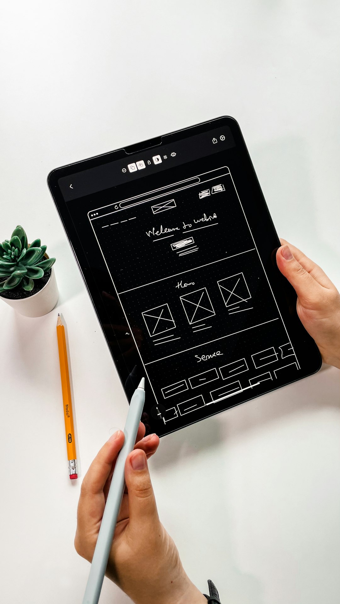 Example of a button component showing different variants, states, and sizes.
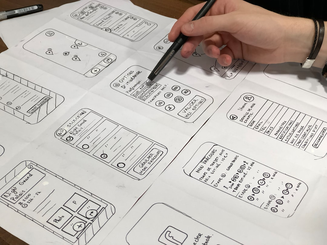
Document as You Go
Documentation is a crucial part of the component creation process:
- Document the purpose and use cases for each component
- Provide clear guidelines on when to use each variant
- Include accessibility considerations and requirements
- Add examples of correct and incorrect usage
- Include any relevant research that informed design decisions
Phase 4: Implementation and Integration
A design system's value is realized when it's actually implemented in products. This phase focuses on bringing your components to life in code.
Bridge Design and Development
Close collaboration between designers and developers is essential:
- Establish a shared language for component naming and properties
- Determine how design tools will connect with development workflows
- Agree on handoff processes and documentation standards
- Consider tools that can generate code from design files (Zeplin, Figma, etc.)
Choose the Right Technical Approach
The technical implementation will depend on your tech stack and requirements:
- Component framework - React, Vue, Angular, Web Components, etc.
- CSS methodology - CSS Modules, CSS-in-JS, utility classes, etc.
- Package distribution - How teams will access and update the components
- Version control - Managing changes and updates
Ensure Accessibility Compliance
Accessibility should be a fundamental aspect of implementation:
- Follow WCAG guidelines for all components
- Implement proper semantic HTML
- Ensure keyboard navigation works correctly
- Test with screen readers and other assistive technologies
- Document accessibility features for each component
Set Up Testing Procedures
Robust testing ensures components work as expected across different contexts:
- Unit tests for component functionality
- Visual regression tests to catch unintended style changes
- Cross-browser and cross-device testing
- Performance testing, especially for complex components
- Accessibility testing tools and procedures
Phase 5: Release, Adoption, and Governance
Launching your design system is just the beginning. Success depends on adoption and ongoing management.
Create a Release Strategy
Plan how you'll release your design system to teams:
- Consider a phased approach, starting with pilot teams
- Develop a versioning strategy (semantic versioning is recommended)
- Establish a changelog process for documenting updates
- Determine the cadence for releases and updates
Drive Adoption
A design system is only valuable if people use it:
- Create onboarding materials and training sessions
- Develop compelling showcases demonstrating the system's benefits
- Identify and support "champions" within different teams
- Provide ongoing support through office hours or dedicated channels
- Gather and act on feedback from early adopters
 Example of a well-documented design system with clear guidelines and usage examples.
Establish Governance Processes
Long-term success requires clear governance:
- Define who makes decisions about the system
- Establish processes for requesting changes or new components
- Create contribution guidelines for team members
- Set up regular review sessions to evaluate the system
- Plan for handling breaking changes
Measure Success and Iterate
Use the metrics you defined earlier to evaluate progress:
- Track adoption rates across teams
- Measure time savings in design and development
- Monitor consistency improvements across products
- Gather qualitative feedback from users of the system
- Use insights to prioritize future improvements
Common Challenges and How to Address Them
Even well-planned design systems face obstacles. Here's how to handle common challenges:
Balancing Consistency vs. Flexibility
Finding the right balance between enforcing consistency and allowing for product-specific needs can be difficult:
- Identify where consistency is critical (brand elements, interaction patterns) vs. where flexibility is needed
- Create components with appropriate configuration options
- Establish clear processes for requesting exceptions
- Document when and how to extend the system for specific needs
Maintaining Momentum
Design systems often start with enthusiasm but can lose momentum:
- Secure dedicated resources for ongoing maintenance
- Celebrate and publicize wins and improvements
- Regularly demonstrate the value being delivered
- Keep the community engaged through events and communication
Managing Technical Debt
As products evolve, keeping the design system aligned can be challenging:
- Plan for regular refactoring and updates
- Balance backward compatibility with the need for improvements
- Develop a clear deprecation strategy for outdated components
- Consider migration tools or guidance for major updates
Conclusion
Building a successful design system is a journey that requires planning, collaboration, and ongoing commitment. When done well, it creates tremendous value by improving consistency, accelerating development, and enabling teams to focus on solving user problems rather than reinventing basic UI elements.
Remember that a design system is never truly "finished"—it should evolve alongside your products and organization. By establishing strong foundations, clear processes, and a culture of continuous improvement, your design system can scale effectively and provide lasting benefits.
Start small, focus on high-impact areas, and build momentum through demonstrable successes. With persistence and the right approach, your design system will become an invaluable asset for your entire organization.