Typography is far more than just selecting fonts—it's a crucial aspect of user experience design that can make or break a digital product. Good typography enhances readability, establishes hierarchy, and creates an emotional connection with users. In this article, we'll explore practical typography techniques that can significantly improve your design's usability and aesthetic appeal.
The Fundamental Role of Typography in UX
Typography accounts for over 90% of design in most digital products. It's not just about making text look good—it's about creating a seamless reading experience that guides users through content efficiently and effectively. Well-executed typography can:
- Improve readability and comprehension
- Establish clear information hierarchy
- Set the emotional tone of the interface
- Reinforce brand identity
- Guide users to take specific actions
Let's explore specific techniques to achieve these benefits.
1. Optimize Line Length for Better Readability
One of the most impactful yet often overlooked aspects of typography is line length. Lines that are too long force users to work harder to track from the end of one line to the beginning of the next, while lines that are too short disrupt reading flow with frequent line breaks.
Best Practices:
- Aim for 45-75 characters per line (including spaces) for body text. This range is considered optimal for readability in most contexts.
- Use narrower columns for mobile (around 35-45 characters) to accommodate smaller screens while maintaining readability.
- Test your content at different screen sizes to ensure line length remains within readable ranges as the viewport changes.
 Comparison of text with optimal line length versus text with excessively long and short line lengths.
2. Create Clear Visual Hierarchy with Type Scaling
A well-defined typographic hierarchy helps users scan content efficiently and understand the relationship between different elements. Establishing a clear type scale is fundamental to creating this hierarchy.
Best Practices:
- Establish a consistent type scale with meaningful size differences between levels (e.g., using a ratio-based scale like 1.2 or 1.5).
- Limit the number of sizes in your interface to 3-5 to maintain visual consistency.
- Use additional properties like weight, color, and spacing to enhance hierarchy without adding more sizes.
- Test your hierarchy with the squint test—blur your vision slightly and see if the importance of elements is still clear.
 Example of clear typographic hierarchy using size, weight, and spacing to distinguish between levels of content.
3. Improve Readability with Proper Line Spacing
Line spacing (leading) significantly impacts readability. Too little spacing creates a crowded, difficult-to-read block of text, while excessive spacing disconnects related lines and slows comprehension.
Best Practices:
- Set line height to 1.4-1.6 times the font size for body text in most applications.
- Use tighter line spacing for headings (around 1.0-1.2) to keep them visually cohesive.
- Adjust line spacing based on line length—longer lines benefit from slightly increased spacing.
- Consider font characteristics—fonts with larger x-heights typically need more line spacing.
 Comparison of text with optimal line spacing versus text with inadequate and excessive spacing.
4. Choose Fonts with Purpose and Restraint
Font selection is perhaps the most obvious typographic choice, but it's also where many designers go astray by prioritizing aesthetics over usability or using too many different typefaces.
Best Practices:
- Limit your design to 2-3 font families to maintain visual cohesion.
- Select fonts with adequate variation in weights and styles to create hierarchy without introducing new typefaces.
- Prioritize readability over decoration, especially for body text and small UI elements.
- Consider technical aspects like rendering quality across platforms, language support, and loading performance.
- Test fonts at intended sizes—many fonts that look great in headlines perform poorly at small sizes.
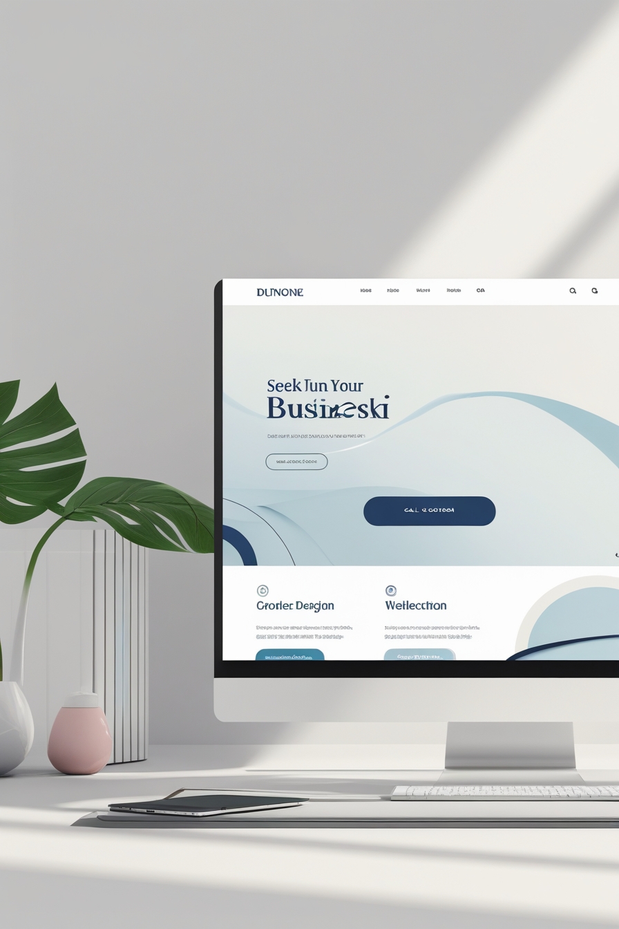
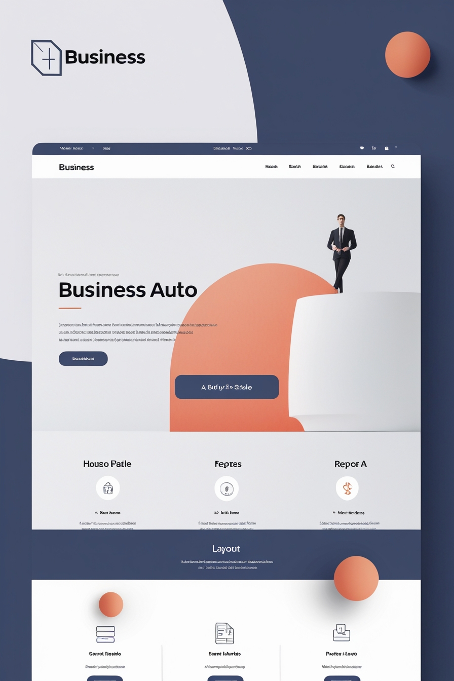
 Example of effective font pairing with complementary heading and body fonts.
5. Use Appropriate Contrast for Accessibility
Text contrast is critical for readability and accessibility. Low contrast text may look stylish but can be impossible to read for users with visual impairments and challenging even for users with perfect vision in suboptimal conditions.
Best Practices:
- Aim for a minimum contrast ratio of 4.5:1 for normal text and 3:1 for large text (WCAG AA standards).
- For optimal accessibility (WCAG AAA), use 7:1 for normal text and 4.5:1 for large text.
- Test your color combinations with tools like the WebAIM Contrast Checker or Stark.
- Consider environmental factors—text may be harder to read on mobile devices in bright sunlight.
- Don't rely solely on color to communicate important information.
 Examples of text with various contrast ratios showing accessible and inaccessible combinations.
6. Create Rhythm with Consistent Spacing
Typography isn't just about the characters themselves—the space around text is equally important. Consistent spacing creates a visual rhythm that makes content more digestible and aesthetically pleasing.
Best Practices:
- Establish a spacing system based on a consistent unit (often related to your base font size).
- Use proportional spacing—larger elements typically need more space around them.
- Keep spacing consistent between similar elements throughout your interface.
- Pay attention to paragraph spacing—aim for space between paragraphs that's 1.5 times your line height.
- Use white space strategically to group related information and separate distinct sections.
 Example of a consistent spacing system creating visual rhythm in a layout.
7. Optimize Typography for Scanning
Users rarely read digital content word by word—they scan for relevant information. Well-designed typography facilitates this scanning behavior, helping users find what they're looking for quickly.
Best Practices:
- Use descriptive headings and subheadings that clearly communicate section content.
- Implement bulleted or numbered lists for sequential or related items.
- Highlight key terms with bold formatting (use sparingly).
- Keep paragraphs relatively short (3-5 lines in most contexts).
- Use section dividers, white space, or background colors to create visual breaks.
 Comparison of text formatted for easy scanning versus dense, undifferentiated text.
8. Ensure Consistency Across Platforms
Typography should remain consistent and functional across different devices and platforms. This requires careful planning and testing rather than relying on default behaviors.
Best Practices:
- Use responsive typography that scales appropriately across screen sizes.
- Test your typography on actual devices, not just in design tools or browser emulators.
- Specify appropriate fallback fonts in your font stack to maintain design integrity if custom fonts fail to load.
- Consider using system fonts for UI elements to ensure consistent rendering and optimal performance.
- Test loading performance of custom fonts and implement strategies like font subsetting or variable fonts to optimize.
Conclusion: Typography as a UX Foundation
Typography forms the foundation of digital user experience. By implementing these techniques—optimizing line length, establishing clear hierarchy, using appropriate spacing, selecting purposeful fonts, ensuring adequate contrast, creating rhythm, designing for scanning, and maintaining cross-platform consistency—you can significantly improve the usability and appeal of your digital products.
Remember that good typography often goes unnoticed because it creates a seamless reading experience that doesn't call attention to itself. When users can effortlessly consume content and navigate your interface without thinking about the text itself, you've achieved successful typographic design.
As you apply these techniques to your projects, consistently test with real users and gather feedback. Typography preferences can vary based on audience demographics and content type, so ongoing refinement is key to creating truly exceptional typographic experiences.